Aerisi Kalinoth & Air Priest Painting Guide


Aerisi Kalinoth and Air Cult Priest painting guide


With the components cleaned up and attached to their individual stands, they are then sprayed with a mid-grey primer. Any imperfections can easily be seen at this point and any further cleaning completed.


Aerisi

I generally start painting the largest part on the model. The colour scheme of her dress is white with blue shadows to reflect the air theme; this keeps the coverall colour scheme light and will compliment her raven hair and silver spear.


This ink is dark midnight blue. I have concentrated the shading near the waist armour plates and the deepest creases.


With the black undercoat added, the contrast with the dress is even more dramatic.


Skin

The brief asked for Aerisi to have pale grey skin with violet and blue undertones.  I am a big fan of painting pot to pot when I can, taking out the more complicated stage of making paint mixes, which are difficult to replicate exactly. Games Workshop’s Demonette Hide, Slannesh Grey and white are just the right tone for her skin.


This image shows the transition through the skin colours, right up to off-white with the final highlight.


The lips are painted with dark magenta basecoat, followed by magenta highlights. The same paint was used in a thinner watercolour mix for the eye makeup.


Her blue/black raven hair was only highlighted at the extreme ends, to keep the overall colour still black.


Amour


The armour was painted in dark turquoise with a gloss varnish to add depth, richness and a contrasting finish.


Windvane spear


A very simple silver and black colour scheme, with subtle blue ink washes mid-way through the process.


Wings


Using the cover art for ‘Princes of the Apocalypse’ as reference, I have opted for a warm grey and black colour scheme. The first two stages are blocking each part, to create individual feathers and then small lines were painted on to add texture. These lines are then highlighted up to white then the black caps and small bands were added last.


The back wings are a ochre colour scheme with black and white wing-tips, providing the contrasting colours needed to pop the details out, even more.


The wings were carefully removed from their holding pin, re-drilled and pinned to the body for a solid fit. A final touch-up with the highlight colours on the extreme edges in done in situ, I can see the lightsourcing properly in its final position and make any small adjustments.


Base


The pale grey blue stone block flooring compliments the overall pale blue and white colour scheme. The final stage is thin washes of green in small patches over the blocks to add subtle variations, with a neutral brown colour for the screed bedding material.


With the painting completed and varnished, (never varnish the plastic stand as it will turn cloudy), gluing the flying stand in place is next, followed by a dry-fit with the miniature and then final attachment. I will leave the static grass stage till both figures are ready.


Priest


The reference for the Air Cult priest shows him wearing a warm oatmeal / white cassock with vulture feathered mantle.


The feathers are painted in a similar way to Aerisi’s raven hair. The final black ink wash is just to calm down the highlights and bring the overall colour back to black.


Skin tones

This selection of paints are my standard Caucasian skin colour, followed by the pink/brown paint, Brown Rose for the lips.


Helmet

After applying a basecoat of black, I have combined dark silver and black paint into a 50/50 mix.


This is followed by lighter silver then ink washed with a thin black to bring out the details.


Sleeves


With a miniature which has a very limited colour scheme, it is important to have at least one contrasting colours. Painting a mid-tone blue on the sleeves adds another point of interest.


Censer of controlling air elementals

This important magical item has rolling clouds inside. To replicate that effect, I have painted lightning-esque pattern over the ceramic parts and then added thin coats of mid-blue in watercolour washes to give some variation.


Static grass

Now all the components are fully painted, the last thing to finish with is to glue the static grass on the bases, inbetween the stone blocks.


Box cover

I tend to take a lot of images in different settings, to find the one that is just right for the box cover.


The final image.


How to lightsource miniatures and scenery

Painting a lightsource on a miniature can really add character and visual interest, whether it is from a flaming torch or a magical lighting effect. In this stage-by-stage example, I have used a wall section, mainly because it’s a large area so you can see what is going on. These techniques are easily transferable to any miniature.


Stage 1


This stage is a drybrush of a mid-grey (German Tankcrew 333)

With any large area I paint, there is a balance between looking good and the time taken. Over the years I have developed a quick and realistic technique using oil paint washes. I use all three Vallejo paint ranges (Model Colour, Panzer Aces and Game Colour) in most cases and I will list the code number in the text. If there is another brand or product, I will mention it when used.


Stage 2

This Stage is a drybrush of a lighter tone of Grey (Dark rubber 306). With this slow build-up of colour, it gradually brings out the details.

Stage 3

This Stage is the initial wash with a dark brown oil wash, sometimes called a filter.

I have use MIG dark wash for this. The benefit of filters is that they take an hour to dry, giving you time to blend the shade back into the grey bricks with turpentine or thinners. They also dry in a smooth, even finish, unlike inks. As you can see, the finish is quite gloss, so a good quality spray matt varnish is essential. I recommend Army Painter or the king of varnish, Testors Dull Cote spray.

Stage 4

The excess oil paint has been wiped off with a soft cloth (another benefit with filters) and a layer of matt varnish applied to seal the work so far. The shade is far less pronounced when dry, giving you a subtle finish.>

Stage 5

The brick highlights are painted with a mid-grey (neutral grey 992), following the direction of the arrow. >All the scuffs and scratches are painted in at this stage. As you can see, each individual brick has a border making it more 3D.

Stage 6

Just to add some variety and to make this wall more natural, I have brushed in vertical streaks, a dark green filter and earth effects from AK interactive. (Another fine company with the painter in mind) That is the wall painted. It seems like a lot of steps, but it is actually a quick method to use.

Stage 7

The light sourcing begins with Tamiya clear yellow (X-24) mixed with Tamiya X-20A thinner, in a very thin wash. The theory behind this is to build up the more intense colour layers nearer the source, which is the top right corner. These layers gradually change the wall colour from grey to yellow in a smooth transition,
Stage 8

I have added more clear yellow to the paint mix and painted it inside the existing weak yellow tone.

Stage 9

The yellow tone is starting to build up to a substantial yellow color.

Stage 10

This final layer of clear yellow is straight from the pot, without any thinner added, for a concentrated color.

Stage 11

The first stage of the light source highlights are applied using a mid-tone yellow (Gold Yellow 007), following the direction of the arrow.

Highlights are also painted further out than the clear yellow paint, giving a subtle effect on the top of the bricks.

Stage 12

The edges of the bricks are now highlighted with a bright yellow (Moon yellow 005), concentrating on the top right corner of the brick.

Stage 13

The final dot highlight is applied in the top right of each brick. The whole wall is then varnished; notice how the whole effect is slightly toned down.


The sewer backdrop is very heavily weathered with oils and left as a gloss finish.


The Tomb of Horrors backdrop with multiple light sources adds warmth to an otherwise very drab (and cold) dungeon, as above.

Light sourcing magic

The same principles are used for magical effects, just with different colours. Tamiya also have a small range of transparent / clear paints ideal for these effects. As described in stage 7, weak washes are initially painted on, building up to a stronger pigment where the light is at its most intense.


The base was painted first as a standard wooden floor and then the washes of red, orange and yellow were applied around the rings. I have followed the direction of the wood texture with the highlight paint colours to accentuate the wood grain. 


The final Anton & Umara- Sundering book 4 box cover.


The lava field base

The same techniques are used here, just on a larger scale. The sides of the rock closest to the hot lava were initially drybrushed with a mid-tone yellow and then washed with a thinned down Tamiya clear yellow paint, to add richness and slightly darken the colour so the final highlight on the extreme edges, with Vallejo Flat yellow 953 will really stand out.


Applying this to miniatures

With the same techniques used as above I have lightsourced Lorcan, a Cambion character taken from the Sundering books.

With the palette of this figure being limited to only red, black and silver, adding a light source from his flaming sword, is a good way of introducing another colour.

I have used the natural seam-line of the leg armour plates as a hard edge highlight and a focus for the paint to follow.


Farideh & Lorcan – The Sundering book 3 box cover.


Behir Painting Guide

Purple Worm (71007)  Purple Worm (71007)
To buy the models featured in this article click here...


When doing any sort of painting, you will need a few tools and equipment to get you started. 


Work space


Whether you have a dedicated room or you are a kitchen table evening painter, you need to get comfortable. Painting figures does require many hours of sitting in the same position, so make sure your chair and table are the right height for you.


As you can see, my work space is situated next to a window for daylight and ventilation. I keep my area clean, so I don’t have to tidy up before I start.


Lighting


Your light is the most important item on your desk. It is the first thing you switch on before you start. I recommend that you do not use a normal tungsten bulb as they cast a yellow light, but use a blue daylight hobby bulb. This gives a consistent bright colour balance over the whole table.


Brushes


I cannot stress enough about buying high quality brushes for the bulk of your painting, preferably Kolinsky sable. My favourite are Windsor & Newton series 7 in sizes ‘00’ ‘0’ and ‘1’.


Palette


There are many available on the market, but I keep coming back to the cheapest and re-useable; a rectangle of cardboard wrapped in ordinary brown tape. (They grow over time!) Acrylic paint does not like new over old, as it re-hydrates and breaks apart, leaving fragments in your mix. Brown tape avoids all that.


Preparing miniatures for painting


As part of the production process, the silicon mould which the resin is poured into has release agents in it, which are sometimes transferred onto the miniature. It is recommended that you wash the miniatures in warm, soapy water and make sure they are completely dry, before any cleaning up or spraying with primer.


Primer


Aerosol primer is the best way to give the miniature a good surface to paint over. It has the benefit of showing you any bits of cleaning up that you have missed. I use three main colours, depending on the figure’s colour scheme; black, grey or white. Unless it is raining, I always do this outside.


Hold the miniature about 15 cm away from the can and spray in long even strokes. If it is cold outside, a good tip is to gently heat up the spray can in warm water. This helps with the flow of paint, for an even coat. I then give the figure a blast with the hairdryer. This ensures that the primer is dry and it also bakes the primer, making it tougher and less prone to scratches or rubbing off.


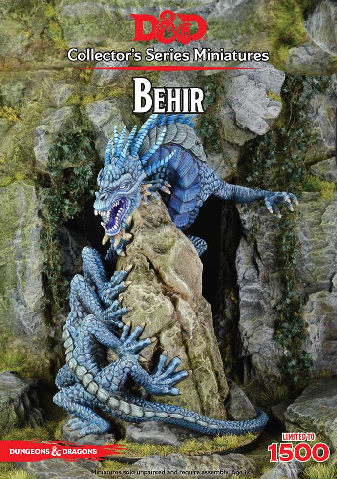
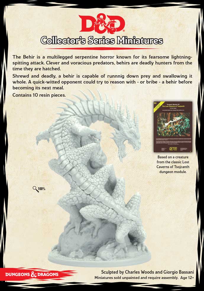
I have used Army Painter uniform Grey primer for the Behir, a neutral undercoat with good smooth coverage.


Paint


For this painting guide I have used Vallejo Model Colour and Vallejo Game Colour. If you are using different paints I have added colour swatches, so finding the correct colour should be straightforward.


Drybrushing technique for large textured areas


With Drybrushing, the idea is to highlight the raised surfaces by applying a very small amount of paint to your flat brush and then dragging the brush across the grain of the texture in a side to side motion. This is a quick way to add colour to a large area. A word of caution, this technique does wear out brushes quickly, so use older brushes if you can.


Once the paint is dry, I tend to tone the colour down (it has a tendency to look chalky) and add richness, by washing the surface with inks or oils and then re-highlight sharp lines with the lightest colour used for drybrushing.


Basecoat - Drybrush 2-3 stages - Shading with washes - line highlights - adjustments


Rock stack


I painted a basecoat of Flat earth over the rocks and then drybrushed Dark Sand 847 to pick out the major details, and then repeated the process with Pale Sand 837 as a highlight. The final Ivory 918 colour is drybrushed sparingly on the edges of the rock, staying away from the natural shadows underneath the Behir. This is the initial paint stages finished; I will shade and add the final highlights later when the Behir is painted, so it can be completed in one go. This method gives me more control over the whole model and allows me to adjust the lightsourcing in context. When the painting is finished, I always closely review the miniature as a whole and make more adjustments.


Behir body


It is important to paint an even smooth coat of paint, even if it takes two coats, as this is the shade colour for all the drybrushing.


To begin with, a solid basecoat of Sombre Grey 048 with a small amount of black added to the mix. I generally add a tiny amount of black to the basecoat, so I can drybrush back over this with just the field blue colour. This is a subtle effect, but acts as a dark highlight in the deepest of the recesses, close to the rock face and the creases on the legs.


Now with the first few stages of the skin finished, I can repeat the same process on all the separate parts of the Behir; scales, claws and details on the face. With all the different areas basecoated, it gives me the first impressions of the colour palette. From here I can see what compliments each other and what details can be ‘boosted’ by using an opposing colour e.g. the gum basecoat is Purple 959 against the teeth basecoat of Dark Sand 847. 


This is the drybrushing stages finished. At the moment it does look overexposed with the highlighting, but that will change after a few washes. These colour variations will dull down giving a more natural, realistic appearance where animals are more than just a flat colour. These different tones will serve as a good basis for the sharp highlights.


Shading


There are a multitude of products available for shading: inks, transparent colours, oils paints and filters.


I will write a full article about this interesting subject, at a later date.


Thinned paint- If you do not have access to any of these products, you can thin down your paints to a water colour consistency and they work just as well, in fact sometimes better as they dry to a mat finish, unlike inks.


Inks- Nearly every manufacturer makes inks to complement their own paint ranges. It comes down to personal taste and the finish that you require. There are two ranges that I frequently use, as they are not pre-thinned like Citadel washes, giving me more control over the opacity.


Winsor & Newton Inks for a very strong pigment in general colours.  They have to be thinned with water (I use 50/50) or they will cover all your previous hard work.


Magic Color Inks, which are liquid acrylics, have a large range with over 20 specific colours available e.g. Flesh, Rust and Golden Sand. They have a strong pigment which does need thinning with water. I cannot recommend this range enough.


As the Behir at this stage is looking quite bleached out, a few thin ink washes with a dark blue were painted over the entire to provide some instant shading. Beginning with the lighter blue tones, I gradually added more and more black ink to the mix, working this darker colour into the deep hollows and creases.


For the back spine which is greyer in colour, I have used 2 thin washes with black ink and re-painted any mistakes around each scale with black paint, this creates a neat border around each element causing the highlights to really stand out.


Highlights


Now that the shading is finished, the next stage is to highlight all the different areas, this light sourcing brings out all of the prominent details and helps differentiate the main characteristics of the Behir, the focus being the face, back spine and feet.  When painting miniatures for photography I have to exaggerate this, to make sure that everything stands out that needs to. At this stage I change my brush size to ’00’. This still holds enough highlight colour to be able to paint thin lines on the edges of all the scales and textures.


Blue spine horns, spine scales and belly scales


When the initial drybrush layers were applied, I was not very happy with the finish on these horns, any small and pointed will always collect more paint from the wide drybrush. Re-painting them again will make them a more visual feature of the model. 


Spine and belly scales


To make the spines a stand out feature, I have selected a blue grey colour palette. By painting small lines on the surface and gradually building up in lighter tones, it produces a quick alternative texture.


The same process of painting small lines is repeated on the belly scales, working through to the lighter tones. 


Small body scales


Following the previous drybrushing, I can see where the highlights fall on the small body scales, the shaded areas are left without any highlights to increase the overall contrast. Each scale is given a sharp highlight followed by a dot highlight on the extreme edges e.g. knee caps and elbows.


The feet have been highlighted in the same colours as the scales to match in, I have used the Glacier Blue on the knuckles and where the claw meets the toe.


Rock stack


With an area as large as this, it gives a little more freedom to add more subtle tones than usual. For the rocks I have used dark brown, sepia and green ink washes.


You can see the progression through the drybrushing stages and inks.


Just for some variety, the separate rocks at ground level are painted with neutral greys and washed with the same inks.


Small details- claws, gums and teeth


The claws are first painted with a solid basecoat of Beige Brown. The Ivory mid-coat colours are thin lines meeting at the point of the claw, with the final highlight of Off-white at the tip.


The Behir’s eye is simply flat white 951 over a Black 950 basecoat.


Base


The sandy groundwork is painted first, then the static grass glued down with PVA glue. Once dry, the tufts can be drybrushed with Buff 976. This does two things, it makes the static grass more durable to handling and it brings out the detail of each individual blade.


Box cover


Once the model has been thoroughly checked over for any mistakes, it can be photographed for the box cover. I have used our cave setting for this model as the dark cave entrance serves as a contrasting colour which also frames the Behir nicely.


The Dungeons & Dragon logos and text are added, finishing the project.


Adding Texture to Large Creatures

 Scoundrels of Skullport (71015)  Scoundrels of Skullport (71015)  Purple Worm (71007)  Purple Worm (71007)
To buy the models featured in this article click here...

When sculpting large creatures, there is always a balance to find between adding details and textures and making the model look over complicated and sometimes a little messy. It is good to leave blank areas sometimes, as a ‘painting solution’, to do your own thing; shields and banners are a good example of this.


Painting texture on an otherwise blank surfacecan really bring your creatures to live and give them added character. Two good examples of this, are the terrifying Beholder crime boss, Xanathar from the Scoundrels of Waterdeep box set and the Purple Worm.


Xanathar

I decided to take an unconventional approach to this beast, and use the painted texture as a highlight. After the initial assembly, the eye stalks were pinned and glued into place, mostly facing forwards in an aggressive pose. This does make it slightly more difficult to get to certain areas, but I can see how the shadows and highlights are working together ’live’ on the miniature.


Notice how the flying stand is attached already. This is masked off with tape before the primer, as you don’t want anything to touch the surface, even varnish, as it will dull and leave a cloudy finish. If this does happen, it can be rectified with a coat of gloss varnish.


As the finished miniature will be blue, I have used black primer. This is the closest colour to the dark blue basecoat.


Painting the main colour

The basecoat of Periscope Blue-309 and a drop of black paint to the mix were applied all over with a large brush, followed by two mid-tones of Dark Prussian Blue-899 and Prussian Blue-965. Even at this stage, I have started to leave the dark basecoat showing at the base of the eye stalks.

The basecoat of Periscope Blue-309 and a drop of black paint to the mix were applied all over with a large brush, followed by two mid-tones of Dark Prussian Blue-899 and Prussian Blue-965. Even at this stage, I have started to leave the dark basecoat showing at the base of the eye stalks.

The first layer of small lines is applied, where the light is falling on the stalks. I have used three layers of paint for this: Magic Blue-021, Electric Blue-023 and Sky Blue-961.


This reminds me of 17th century etch landscape paintings, where the colours and lines are gradually built up.

The horns are treated in the same way, adding more white to the cream mix in small stages, working nearer to the end point of pure white.


Details

Now that the majority of the miniature’s colour is finished, I can really bring out the rest of the details with a strong eye colour. For a stark contrast, I have chosen red eyes. For an added striking effect, the main iris colour is a metallic red, Vallejo Model Air colour: Turn Signal Red- 71070. When finished, the eyes were painted over with three layers of gloss varnish; this makes the colours a deeper and a richer tone.

The Purple Worm

The model was first given a prime coat of black and the first three layers were airbrushed on to save time. I have used Black-950 + Violet Red-812 75/25 mix, same paint 50/50 mix, followed by just Violet Red-812.

Following the existing skin texture, I have built up the colour with progressively lighter tones, with the lightest colours around the maw. I have used Blue Violet-811 and added white for lighter tones.


With the main purple colour finished, I moved on to the mouth colours, using Shadows Flesh-343, Flesh Base-341, Beige Red-804 and Flat Flesh-955, as my final highlight colour. The whole area was given two washes with red ink to emphasise the flesh colours and finally given a coat of gloss varnish. The next stage was to pick out any teeth and horns with black paint. This provides a black border to each part, making it more pronounced and identifiable, very important when painting miniatures that will be photographed for a box cover.

The colours are really starting to come alive, now the horns and teeth are painted black.

As everything on this creature is textured, I left the teeth quite plain, as a contrast.


The belly of the beast

As I mentioned above, the belly is one of those areas which could do with more texture, as it is quite plain. Whilst it’s fine to leave it alone and just paint the belly plates as normal, I’m never the one for taking the easy route!


The belly was base coated with Dark Mud-316, an excellent paint with a really matt finish.

Starting to pick out the different features; using thin lines with Medium Flesh-860.
The next stage is to pick out individual belly scales. I have used a dark brown ink wash, followed by a black wash. The inks are thinned down 50/50 with water for a more translucent finish, which doesn’t disrupt the paint tones underneath too much.
Concentrating on the edges of the scales, the highlights were painted with Iraqi Sand-819.
 Here is a good example of the horns painted. You can see how I have approached each different tone, moving to the tip of the horn.


Lolth, Demon Queen of Spiders Painting Guide

Lolth, Demon Queen of Spiders (71003) Lolth, Demon Queen of Spiders (71003)
 Haven't bought your Loth yet? Click here to find her in our store...

Painting the Spider Lolth: advanced painting guide

To start with the spider was given a coat of black primer. For quick coverage and very smooth blending, I opted for using the airbrush and a ready mixed set of ‘German Grey’ tank colours from AK Interactive. This set provides a good foundation of pre-mixed grey colours.


With the airbrushed paint being so opaque, the next stage is to add highlights with a brush, where the pigment is stronger leaving a ‘line’ texture. I have used Light rubber 305 for this. For the final edge highlights, I have used Sky Grey 989.


The same colours were used all over the spider for highlights, concentrating on the knees and extremities.

It is at this stage the spider starts to look too grey and not black as intended, so I have started to ‘knock back’ the colour with thinned Tamiya transparent paints. 

This product is very useful for covering a large area with an even tint, as it does not form into puddles and dry unevenly. Another benefit of this range is that they dry  gloss, really bring out the original colours.

You can see the spider is starting to get back its black colour, with a hint of purple from the Tamiya colours.

After a few more coats of Tamiya Smoke (black), the whole model was left to dry fully. This give me an opportunity to talk about the scenic base.

Scenic Base

After a black primer coat, it is time to get out the drybrushes. 

For this Under Dark setting, I wanted to keep the ground a warm grey to counteract the dark spider body. Rocks colours can range from white to pink to all the browns and greys, so don’t feel limited to the standard gray tones. For this I have drybrushed German highlight 335 / light rubber 305 / Stonewall grey 049 over a black basecoat.


After the rocks are finished, the next step is to paint in the mud and stones. Because this is a smaller area, a smaller drybrush is required, for this I have used an old size ‘0’.

Groundwork

For the mud colour, I have used my favorite earth coloured paint- Panzer Aces Dark Mud -316. This paint dries with an incredible matt finish and has just the right tone. To pick out the detail, the mud was drybrushed with beige brown 875.


Again, this base is getting too light, so I have knocked it back with an oil filter. These are quick drying (for oils!) and you have the advantage of blending them with turpentine. The effect are quite profound.


Base details

The only stage left to do is to pick out the remaining details, the rusty column ring and a little moss on the fallen pillar.

For the rust effect, I have used a combination of products. AK Interactive rust streaks, Dark rust paint 302 and Orange brown 981. The ring was painted first, followed by the streaks down the stone. This gives the impression that the broken pillar has been there for some time.


To finish off the aging of the pillar, I carefully painted PVA glue into cracks and small areas, and stuck dark green flock down. The flock was carefully drybrushed with Flat green 968 to bring out the texture. I have left the spider on the base till I start pianting  Lolth herself.

 
Back to the spider body

Now the bulk of the painting is complete, I can glue the spider to the base. This allows me to see the model in situ  and to add any details overlooked. This also gives me the correct angles for light-sourcing.

Just like the base, it is time to start adding the details to the thorax. I have gone for the classic black widow spider, with her hour glass markings. To make it a little more organic, I have added small red dots around the main design, this helps break up the  large area.


For an extra rich colour, I have used Burnt Cad. Red 814 basecoat, followed by three coats of Ferrari Red 085 applied in small dots inside the base shapes.


Poison drip

To make this really stand out, I have chosen a bright green, followed by two coats of gloss.

Adventures with gloss varnish !

With the body near completion, the next step is to matt varnish the whole model including the base. This adds another layer of protection before I hand-paint the gloss varnish (the Vallejo gloss has a good shine, but does require two coats) over  the spider. 

After the standard two coats of gloss were applied, something unexpected happened. As you can see, some of the highlighted areas disappeared underneath the shine. Not a disaster, but annoying, none the less.


The solution was to re-highlight the edges and knee joint with light rubber 305 and sky grey 989, and use satin varnish on the front body part and legs. This less shiny finish allows the highlights to been seen properly.
 

Painting Lolth

I needed a colour scheme to compliment the spider, so I decided on rich red gloss armour with a dark purple secondary colour.

With most of the figures I paint, I normally start with either the largest area or the most difficult part (to get it out the way!). In this case the spear and decorated ribbons.


The dark purple clour is a 50/50 mix of black and Violet Red 812 basecoat, with a 812 mid-coat and a Squid pink 013 highlight. The magic symbols are treated differently by painting very thin Sky blue 961 patches along the ribbon with a few random dots, followed by white symbols in the middle.

I wanted a break from the detail work, so I moved on to the red armour.


These are the paints used, going from the black red, through to mid-reds, oranges and highlights of ivory. The armour was knocked back with deep red ink and re-highlighted with Orange fire and Ivory again.


To tidy up all the armour edges, I painted a black border ready for the gold and silver borders. I have used bronze 998 as the shade, building up to a pure silver highlight concentrating on the spider in the middle of her body.

Painting Drow Skin

I don’t pretend to be an expert in painting Drow skin and it took me a few attempts and paint mixes to get the tone right. I have gone for a dark brown, highlighted with warm greys.
 
 
The paint mix is: Rhinox hide + black 50/50 - Rhinox hide + black 50/50 + Dryad Bark – Dryad Bark – German 337 – track primer 304  -  Light rubber 305 -  thin black ink wash – re-highlight with  305.


Her lips are Ferrarri Red to compliment her armour and spider markings.

Lolth Details

Now the two main areas of colour are finished, it’s now time to turn to the details. 

Her hair has a basecoat of light rubber, followed by two additions of white paint to the mix, until you have pure white at the extreme ends. I have also painted the gold head-dress in the same colours as her armour borders.


Lightning effects

This area is a great place to add some light effects here. With some carefull washes, you can really make this another focus point of the model.

For the lightning I have used these paints, with the same principle: after the wash, re-highlight.


Back to the spear

As you can see, I snapped the end off the spear while working. The only thing to do here, is to pin the tip back on for a solid fit.

I wanted to make sure that the spider iconography was present over the model. What better pattern than a web? I have used ghost grey 046 – sky grey 989 – white edges.


I have repeated the pattern, but in red for the other ribbon as well. Because red’s are not the strongest pigment, I first painted the spiders web with Orange fire 008, which has a strong pigment and knocked back the colour with a deep red ink wash. Where the webs meet, are highlighted with the Orange fire paint.


The fishnet effect was a grid painted on with light rubber and highlighted with sky grey where the two strands meet.


The finished model.


Pages: Prev12NextReturn Top